This year PodCamp WesternMass will be held on Saturday, February 25, 2012 at The Kittredge Center at Holyoke Community College. I’ve been attending PodCamps since 2007 and always find these ‘un-conferences’ to be informative, beneficial and fun.

Here’s a little video I put together to promote PodCamp WesternMass 2012:

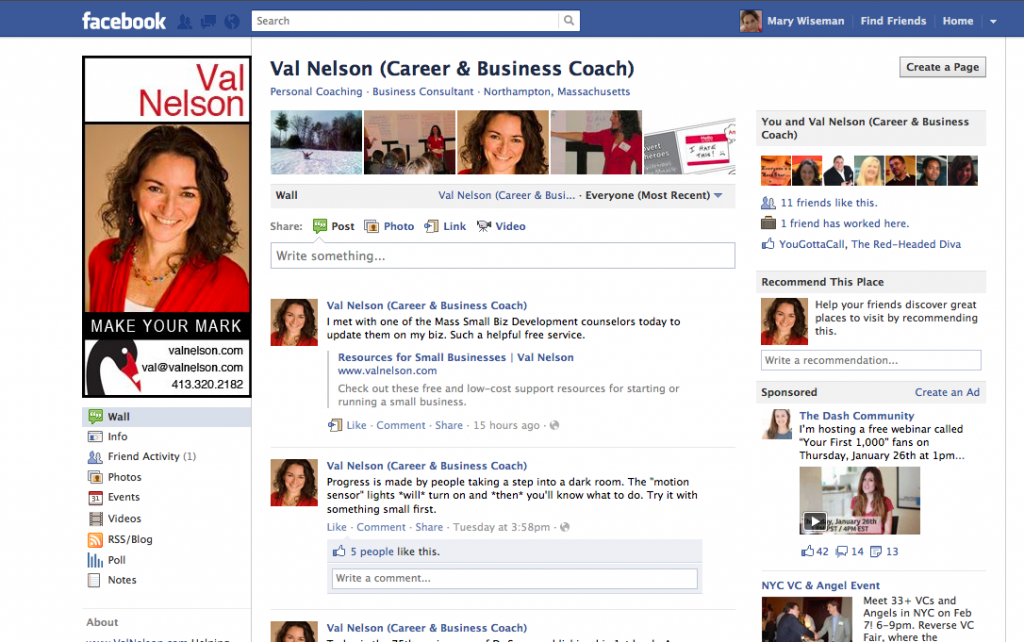
I assisted a client to create a customized FaceBook image for her business page. Val Nelson is a career and business coach who makes it easy for her clients to find clarity and confidence so they can follow their hearts…and make a living.

Customizing your FaceBook page visually: attracts the readers’ eyes to your page,
it helps the reader relate to you on a personal level, and it should assist with boosting the Google search engine optimization for Val’s overall online presence.

Of course, having a beautiful image to work with really helps.  I was able to use the color element to work into the customized treatment of Val’s FaceBook page and further support her overall branding design.

What do you think of Val’s new FaceBook page? I would love to hear your comments.


There are times in an instructional designer’s life when the game changes and Apple has just changed the game-again. This time it is with their iBook Author.  Those who are considering an elearning situation, should consider using this new tool. The ability to interact with the content built in iBooks is amazing for all types of learners. Integrating audio and video right into the iBook allows the learners to integrate with the content.

Anyone who needs a workbook, textbook, manual. job aid, even a magazine, or newsletter should consider this type of learning aid. I will be getting mine soon.

This amazing new [FREE] app iBook Author allows anyone to create beautiful Multi-Touch textbooks — and just about any other kind of book — for iPad. With galleries, video, interactive diagrams, 3D objects, and more, these books bring content to life in ways the printed page never could.

This application has the ability to drag and drop text, images, graphics, video, movies and more into the template.  Apple’s Widgets add Multi-Touch magic to books with interactive photo galleries that bring images to life, engrossing 3D objects you can’t help interacting with, animations that burst off the page, and more.

Another beautiful thing about iBooks Author, it lets you create books that people with disabilities can read and experience. The table of contents, glossary, widgets, main text, and more are built to automatically take advantage of VoiceOver technology. Add accessibility descriptions to any widget or media — including movies and quizzes — so even those with vision impairments can use them.

And you can publish it to the iBookstore or iTunes U or share it with anyone with an iPad.

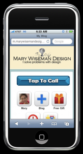
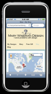
I just finished getting my website into a mobile format, so it is can be easily read with smartphones and/or tablet devices. Now, information about my design work is easy to find while on the go.

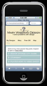
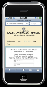
I have created: easy tap buttons for calling or navigating, accordion menus that expand to reveal more in depth information, videos are available, and I have my free gift ready for folks to download.

If you need your website to be mobile, look me up [on your phone] and give me a call.  I can design and create a mobile website for you and your business.

The mobile phone market is growing and you should be growing your business along with that expanding market.  According to the 60 Second Marketer, there are 6.8 billion people on the planet, 4 billions of whom own a mobile phone.  Do you know how many people own toothbrushes?  3.5 billion.  That’s right, more people own a mobile phone than own toothbrushes.

People are using their mobile devices to: locate, learn, communicate, shop, and they respond. It is predicted that by 2013 the primary way people will access the Internet will be via their mobile browsers.


I spent the better portion of last November collating all my favorite places to eat and things to do in Northampton.  I can tell you, I have a pretty big spreadsheet.  Then, I thought of sharing my faves with the readers of Design Sponge and volia…Design Sponge’s City Guide to Northampton. Read all about it and let me know your favorite Northampton spot, event or happening.  Props to designer Carey Baker of Midnight Son Designs and photographer Alvin-San Whaley, who loaned me some of their photographs.

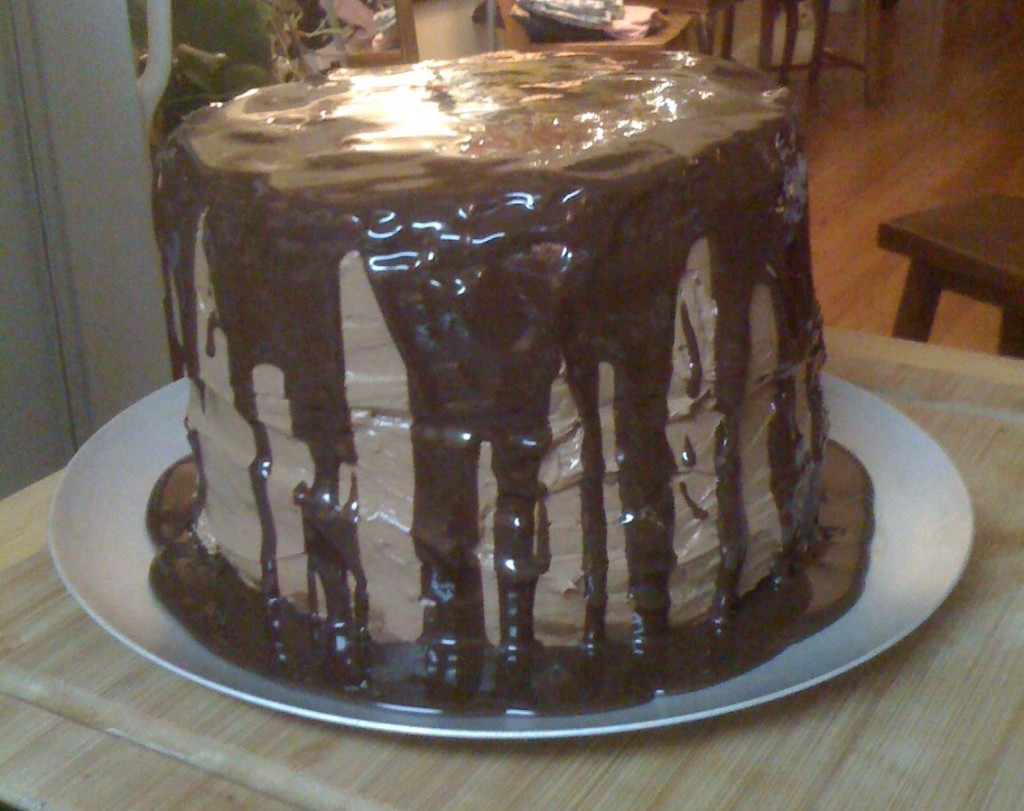
The goal was to make a chocolate stout cake with butter cream frosting and chocolate ganache topping. My daughter started the process following Smitten Kitten’s recipe.

Ta-da…..here it is:

This is no ordinary cake.  THIS, is an epic cake.  It weighs 5+ pounds, it is 3 layers, each layer is smeared with butter cream frosting and the whole thing is laced with chocolate ganache. That’s right, I said 5+ pounds of cake here.

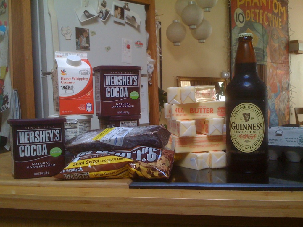
It began as these simple ingredients measured by the pounds.  And this doesn’t show the 4 cups of four [that’s 2 pounds] and 4 cups of sugar [another 2 pounds] required to create such an epic cake.  Are you getting the image of a serious pound cake slathered with buttery, cream chocolate frosting?

This image doesn’t not include the additional ingredients I purchased-see below

What really makes this cake epic, are several things.

  • First and foremost, our oven’s temperature isn’t working quite right. So, the cake was popped into the oven and after 10 minutes the cake started to crack.  After multiple attempts to continue the internal cake baking process, I pulled the cakes from the oven and  dashed to the nearby kitchen supply store to buy an oven thermometer. My daughter left for an appointment to work out at the gym and I watched the oven temperature rise and fall as I tried my best to get the oven to stay at an even 350 degrees. Once I reached that goal, I put the cakes back in to finish baking.
  • Second, I dropped the cake.  That’s right, during the additional baking, I was pulling a cake layer out of the oven and it literally slipped out of my hands, hit the counter [which contained most of the shattered cake layer bits] and the rest splatted onto the floor.   After much swearing, scrapping and clean up – buttery rich cake batter is a real b***ch to clean up.
  • Third, I ran out to the store to buy more ingredients: butter, chocolate, aluminum cake pans [as ours were partially full of half-baked cake #1], more beer and sour cream.
  • Fourth, I didn’t really read the recipe properly and accidentally added a little too much salt. I don’t know, someplace between the frantic dropping of the first round of cakes and trying to find the recipe [on my daughter’s computer]… I mis-read the quantity of salt and added a bit too much.
  • Fifth, we needed LOTs of friends to help us eat this cake.  A single slice was easily divided by 3 people.  I couldn’t even finish half a thin slice myself.

What have we learned from making this Epic Cake? Well, get the oven temperature to it’s proper degree. The thermometer helps. A newer oven would help even more.  Have extra ingredients on hand and ALWAYS read and re-read the recipe.

Oh, and I kinda like that little salty hint mixed into my 5+ pounds of chocolate stout cake. While I’m not sure I would make this cake again, I am sure I will continue baking.

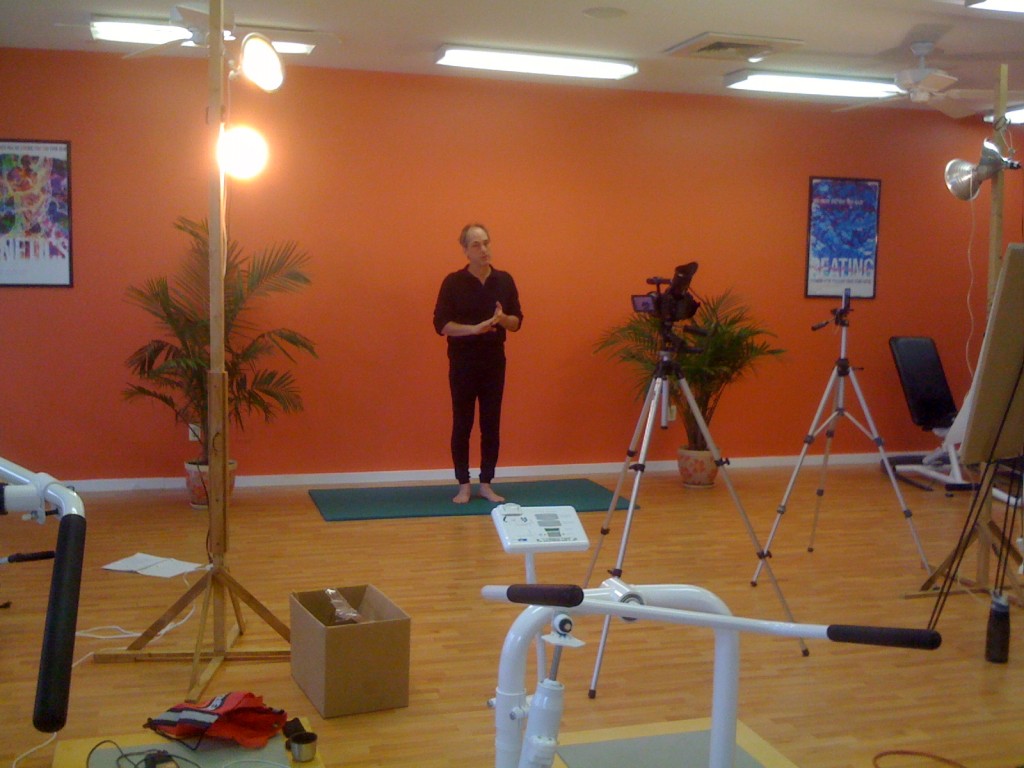
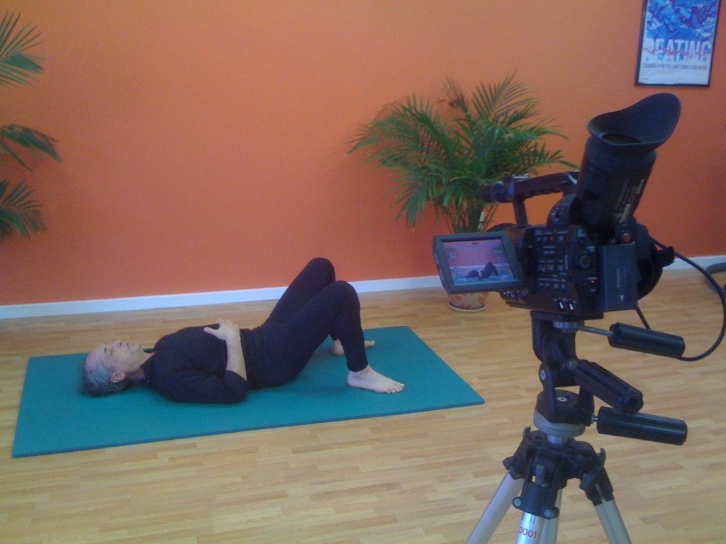
Yes, I worked on New Years Day art directing a video shoot for a Pilates instructor. After 4 hours of shooting, we got the video we need to create How-to videos for a series of eCourses Bob [the instructor] will be emailing out to clients on his mailing list.

One never knows what an instructional designer will do when working with subject matter experts. In order to fully understand the Pilates movements, I had a yoga mat on the side and did the poses as Bob was describing them.  This way I could be sure he was including all the information necessary to be used in the videos.   Being ready to emulate a situation, ask the right questions and give feedback to the expert are a few of the techniques I use when creating instructional design materials.

There are so many moving parts when shooting a How-to video.  Besides the basics of getting the material communicated correctly, there is; the set, mics, lighting, backgrounds, wardrobe, and direction.

It was a fun way to ring in the new year.

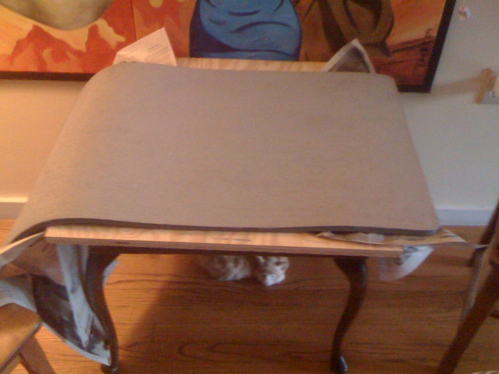
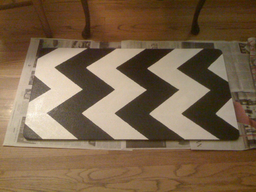
We’ve had this old rug, near the kitchen sink that while comfy on the toes is pretty hideous. Over New Year’s while cruising some interior design blogs, I thought of painting this rug with some chevron stripes.

Before and After

Here are the steps I took to get the Chevron look. The rug is a foam pad, nice on the feet, horrible on the eyes.

Rug Before

Step 1

  • Two coats of primer. I had some latex acrylic left over from another project

Primer

Step 2

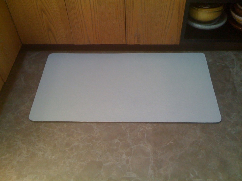
  • Two coats of white latex acrylic base paint
  • I chose an off-white-ivory color thinking bright white might show too much dirt

White Background Color

Step 3

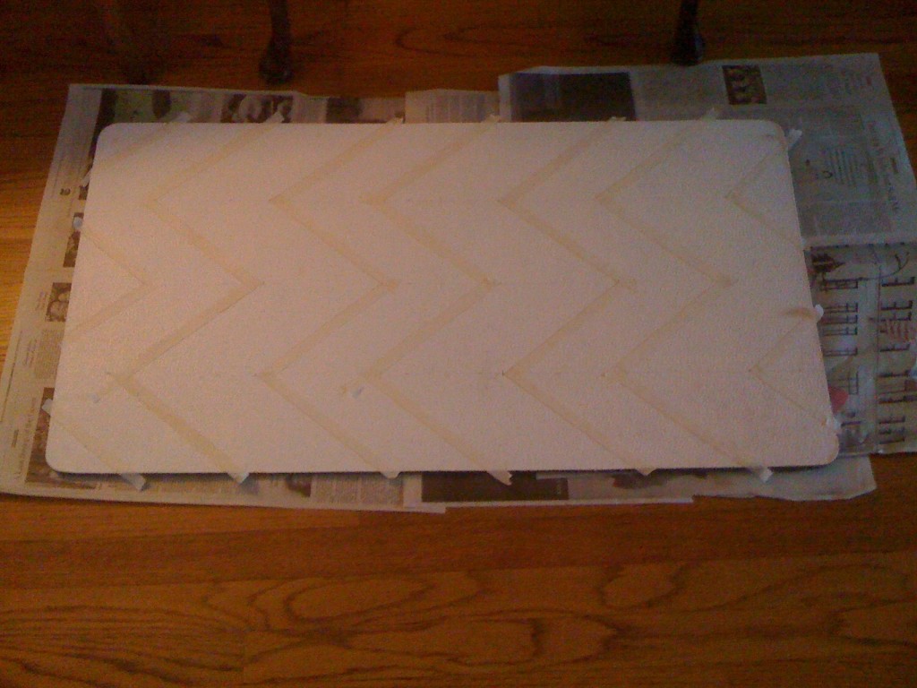
  • Chevron stripes look a little bit like Charlie Brown stripes and achieve the effect, I measured down the center width of the rug, then divided those spaces in half.
  • I wanted the stripes to be fairly thick, you could make ’em wider.  So, I worked from the center outwards measuring 6 inches from the center point.
  • Using a light pencil mark, I ticked the 6 inch measurements and drew the diagonal stripes to form the Chevron effect
  • Finally, I masking taped off the stripes I was going to paint black

Measure twice before masking. This can also be done with a stencil

Step 4

  • I painted in the black stripes
  • Be sure to allow full drying time, then pull the masking tape off
  • I touched up edges with the white paint as well
  • I coated the entire rug with a polyethylene sealer

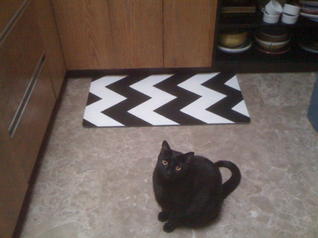
I wanted to see how it was going to look, so I put it by the sink

Finally

The finished rug with Izze posing. He is such a ham!