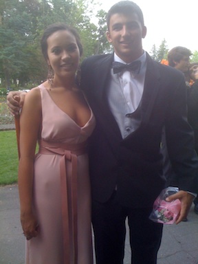
So, this year’s prom dress was slightly less complicated than last year’s dresscue.  Of course, 2011 had a twisty middle and end.

This year’s dress was also inspired by a trip to NYC  last December and a visit to Shareen Vintage. A girl has to start planning Prom way in advance. Post inspiration, was a trip to Osgoods for fabric and supplies and then the sewing began.  Within a few weeks months the dress shaped into this: [I love that Jan got captured in the background.  She was taking images as well.]

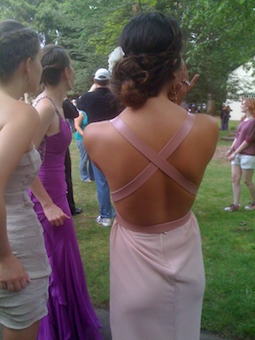
the back of the dress looks like this:

I lined the entire dress and created the straps by cutting and gluing vinyl strips together.

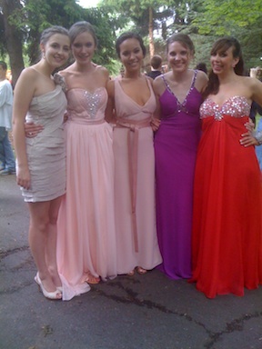
Here’s the whole gang:

Even Brendan happened to be in town:

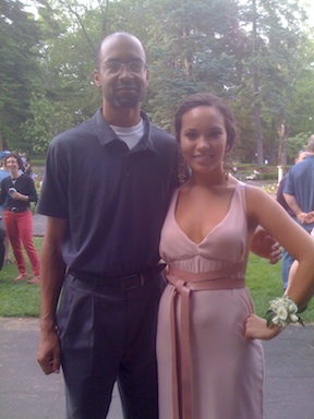
Xernay and Maggie:

And Mr Harp:And Xernay’s friend:

A good time was had by all.

What will be the next Dresscue?

When to know enough is just enough. Ericsson had too much information and needed a message to communicate how a multi-purpose, multi-technology network node enables operators to meet their three priorities in relation to data traffic explosion: differentiation, control and monetization.

The above video is work that makes you jealous, inspires and does both simultaneously.  The beauty of this video is that it is a great example of the changing nature of how instruction can communicate an idea [not just a product].  It shows how Ericsson moves data around, and why it matters.

The House of Radon did the creative work and really hit the nail on making sense out of a concept. The video’s message “appeals to the senses.” Data, nodes, operators, differentiation–all of these ideas in Ericsson’s brief are just so much insubstantial vapor. House of Radon’s video translates them into snappy factoids, which helps. But the idea of embedding them into physically appealing touchscreen interfaces–and then embedding those into a series of viscerally evocative first-person live-action scenelets, where just a hint of sound effects and out-of-focus background action instantly tells your five senses everything they need to know about what’s happening outside the edges of the frame–that’s what makes Ericsson’s brief make sense.

House of Radon’s relentless cutting from new interface/location to new interface/location, three dozen times, is an essential part of getting the message across. As more and more innovative companies find themselves “selling” invisible-but-essential ideas, this kind of advertising-as-sensemaking becomes more valuable than any glib “Got Milk?”-style product campaign ever could be. Does every spot need to cram in 30-odd interfaces and locations to make its point? Of course not. But the designers behind this House of Radon spot know that, sometimes, “too much” is just enough.

Ever since I painted my old kitchen rug with bold chevron stripes, I’ve been thinking about painting my vinyl bathroom floor tiles. So, I gave it a go and it turned out even better than I thought.  Note: I used porch and floor paint from my local hardware store so as to have a durable finish that will withstand the traffic the floor will be receiving and the whole process cost: $75 along with 6 hours of my time [not including the final drying which was an additional 8 hours, overnight]. We were able to walk on the entire floor 30 minutes after the final coat of paint.  I waited the entire 8 hours before putting anything down onto the newly painted floor.

Bathroom Vinyl Tiles Before:
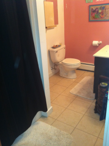


Here is what the bathroom floor looked like before.  This vinyl floor tile was laid directly over old linoleum and the job was, well, let’s just say, did not appear to be completely professional. Added to that, the old, tired swirly pattern in a dull beige…and I think you can start to get the picture.

Step 1 Preparing the old vinyl: I sanded the vinyl floor tiles with a 180 Ct sandpaper.  After sanding I vacuumed the whole area.

Step 2 Creating tooth on the old vinyl: I deglossed the vinyl floor with a deglosser liquid.  This is is a somewhat caustic process, so be sure to wear protective eye wear, gloves, and be sure the area in which you are working is well ventilated.  I had the overhead fan on the whole time and had another portable fan pulling fresh air into the bathroom. The deglosser is applied with a clean cloth and removes any gloss finish the sandpaper didn’t get.  Steps 1 & 2 creates the ‘tooth’ from your old vinyl tiles and prepares the surface to accept the new primer and paint.

Step 3 Painting prep: I used painter’s tape and taped off the areas I didn’t want the paint to adhere to.

Step 4 Priming the vinyl: Primer is then applied. I used 2 coats and laid each coat on somewhat thinly. It took about 45 minutes between each coat to dry. Check the label on your printer and follow those steps.  The primer is an important step that prepares the vinyl surface for painting.  I used disposable sponge paint brushes, however you could use a roller or traditional brush.
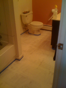


Step 5 White base coat: Since I wanted black and white squares, I next painted on the white base color, over the primer. This time I used a disposable sponge brush and a small roller. The white paint took 2 coats and I allowed 45 minutes between coats for drying.
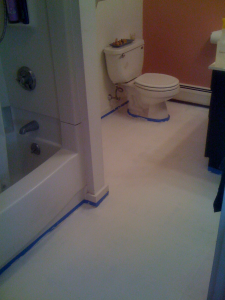


Step 6 Creating the black squares: Taping off the squares was the most time consuming process.  I followed the old tiles, as my guide, and taped off the tiles I wanted to maintain the white color.
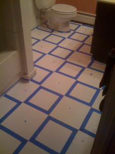


Step 7 Painting the black squares: Next I applied the black paint with another disposable sponge brush.  In order to get the density of black I desired, I applied 2 coats of black, waiting 30 minutes between coats.  After the second coat of black paint went down, I waited another 30 minutes, then pulled up the painting tape.
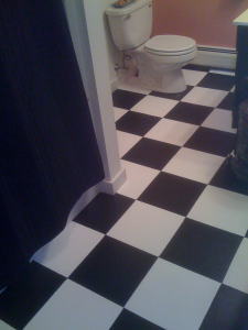
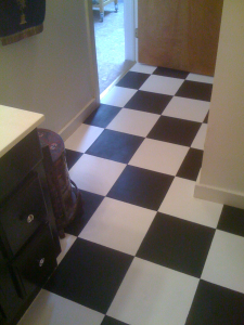


That is all that is needed.  Except I did go in with a small paint brush and touched-up a couple of areas where the black paint had seeped under the painters tape.

One last time: Painting over vinyl tiles.

Before                                                                 After


The whole bathroom appears bigger, cleaner and the eye is fooled into thinking these are actual tiles, when I just painted over the old vinyl floor tiles.


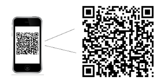
At PodCamp Western Mass #4 I presented a session on Mobile Marketing.  Download a copy of my presentation at SlideShare here.  Or scan any of these QR codes in your smartphone or tablet device. Please share any comments or thoughts you might have.

qrcode

And, if all this isn’t enough, check out this interesting application for QR codes. Thinking beyond the computer screen and how the QR code can be an instructional design tool.

I assisted a client to create a customized FaceBook image for her business page. Val Nelson is a career and business coach who makes it easy for her clients to find clarity and confidence so they can follow their hearts…and make a living.

Customizing your FaceBook page visually: attracts the readers’ eyes to your page,
it helps the reader relate to you on a personal level, and it should assist with boosting the Google search engine optimization for Val’s overall online presence.

Of course, having a beautiful image to work with really helps.  I was able to use the color element to work into the customized treatment of Val’s FaceBook page and further support her overall branding design.

What do you think of Val’s new FaceBook page? I would love to hear your comments.


There are times in an instructional designer’s life when the game changes and Apple has just changed the game-again. This time it is with their iBook Author.  Those who are considering an elearning situation, should consider using this new tool. The ability to interact with the content built in iBooks is amazing for all types of learners. Integrating audio and video right into the iBook allows the learners to integrate with the content.

Anyone who needs a workbook, textbook, manual. job aid, even a magazine, or newsletter should consider this type of learning aid. I will be getting mine soon.

This amazing new [FREE] app iBook Author allows anyone to create beautiful Multi-Touch textbooks — and just about any other kind of book — for iPad. With galleries, video, interactive diagrams, 3D objects, and more, these books bring content to life in ways the printed page never could.

This application has the ability to drag and drop text, images, graphics, video, movies and more into the template.  Apple’s Widgets add Multi-Touch magic to books with interactive photo galleries that bring images to life, engrossing 3D objects you can’t help interacting with, animations that burst off the page, and more.

Another beautiful thing about iBooks Author, it lets you create books that people with disabilities can read and experience. The table of contents, glossary, widgets, main text, and more are built to automatically take advantage of VoiceOver technology. Add accessibility descriptions to any widget or media — including movies and quizzes — so even those with vision impairments can use them.

And you can publish it to the iBookstore or iTunes U or share it with anyone with an iPad.


I spent the better portion of last November collating all my favorite places to eat and things to do in Northampton.  I can tell you, I have a pretty big spreadsheet.  Then, I thought of sharing my faves with the readers of Design Sponge and volia…Design Sponge’s City Guide to Northampton. Read all about it and let me know your favorite Northampton spot, event or happening.  Props to designer Carey Baker of Midnight Son Designs and photographer Alvin-San Whaley, who loaned me some of their photographs.