When to know enough is just enough. Ericsson had too much information and needed a message to communicate how a multi-purpose, multi-technology network node enables operators to meet their three priorities in relation to data traffic explosion: differentiation, control and monetization.

The above video is work that makes you jealous, inspires and does both simultaneously.  The beauty of this video is that it is a great example of the changing nature of how instruction can communicate an idea [not just a product].  It shows how Ericsson moves data around, and why it matters.

The House of Radon did the creative work and really hit the nail on making sense out of a concept. The video’s message “appeals to the senses.” Data, nodes, operators, differentiation–all of these ideas in Ericsson’s brief are just so much insubstantial vapor. House of Radon’s video translates them into snappy factoids, which helps. But the idea of embedding them into physically appealing touchscreen interfaces–and then embedding those into a series of viscerally evocative first-person live-action scenelets, where just a hint of sound effects and out-of-focus background action instantly tells your five senses everything they need to know about what’s happening outside the edges of the frame–that’s what makes Ericsson’s brief make sense.

House of Radon’s relentless cutting from new interface/location to new interface/location, three dozen times, is an essential part of getting the message across. As more and more innovative companies find themselves “selling” invisible-but-essential ideas, this kind of advertising-as-sensemaking becomes more valuable than any glib “Got Milk?”-style product campaign ever could be. Does every spot need to cram in 30-odd interfaces and locations to make its point? Of course not. But the designers behind this House of Radon spot know that, sometimes, “too much” is just enough.

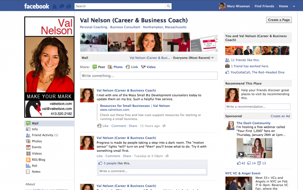
I assisted a client to create a customized FaceBook image for her business page. Val Nelson is a career and business coach who makes it easy for her clients to find clarity and confidence so they can follow their hearts…and make a living.

Customizing your FaceBook page visually: attracts the readers’ eyes to your page,
it helps the reader relate to you on a personal level, and it should assist with boosting the Google search engine optimization for Val’s overall online presence.

Of course, having a beautiful image to work with really helps.  I was able to use the color element to work into the customized treatment of Val’s FaceBook page and further support her overall branding design.

What do you think of Val’s new FaceBook page? I would love to hear your comments.


There are times in an instructional designer’s life when the game changes and Apple has just changed the game-again. This time it is with their iBook Author.  Those who are considering an elearning situation, should consider using this new tool. The ability to interact with the content built in iBooks is amazing for all types of learners. Integrating audio and video right into the iBook allows the learners to integrate with the content.

Anyone who needs a workbook, textbook, manual. job aid, even a magazine, or newsletter should consider this type of learning aid. I will be getting mine soon.

This amazing new [FREE] app iBook Author allows anyone to create beautiful Multi-Touch textbooks — and just about any other kind of book — for iPad. With galleries, video, interactive diagrams, 3D objects, and more, these books bring content to life in ways the printed page never could.

This application has the ability to drag and drop text, images, graphics, video, movies and more into the template.  Apple’s Widgets add Multi-Touch magic to books with interactive photo galleries that bring images to life, engrossing 3D objects you can’t help interacting with, animations that burst off the page, and more.

Another beautiful thing about iBooks Author, it lets you create books that people with disabilities can read and experience. The table of contents, glossary, widgets, main text, and more are built to automatically take advantage of VoiceOver technology. Add accessibility descriptions to any widget or media — including movies and quizzes — so even those with vision impairments can use them.

And you can publish it to the iBookstore or iTunes U or share it with anyone with an iPad.

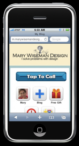
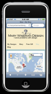
I just finished getting my website into a mobile format, so it is can be easily read with smartphones and/or tablet devices. Now, information about my design work is easy to find while on the go.

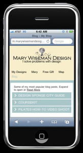
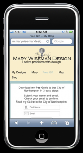
I have created: easy tap buttons for calling or navigating, accordion menus that expand to reveal more in depth information, videos are available, and I have my free gift ready for folks to download.

If you need your website to be mobile, look me up [on your phone] and give me a call.  I can design and create a mobile website for you and your business.

The mobile phone market is growing and you should be growing your business along with that expanding market.  According to the 60 Second Marketer, there are 6.8 billion people on the planet, 4 billions of whom own a mobile phone.  Do you know how many people own toothbrushes?  3.5 billion.  That’s right, more people own a mobile phone than own toothbrushes.

People are using their mobile devices to: locate, learn, communicate, shop, and they respond. It is predicted that by 2013 the primary way people will access the Internet will be via their mobile browsers.

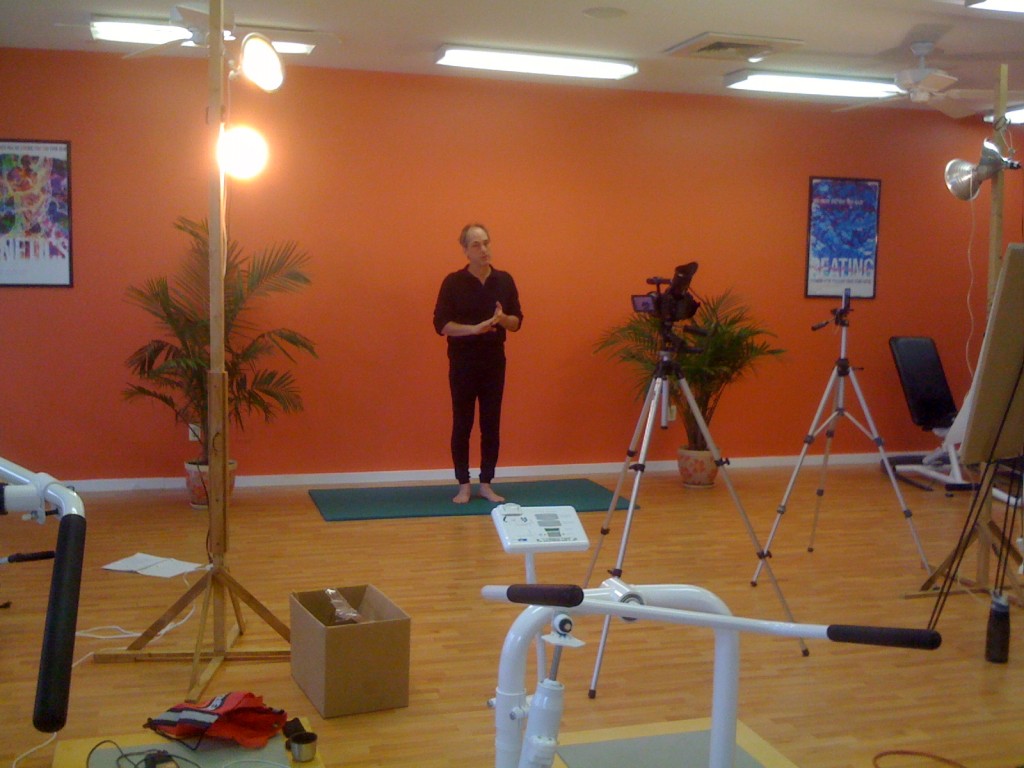
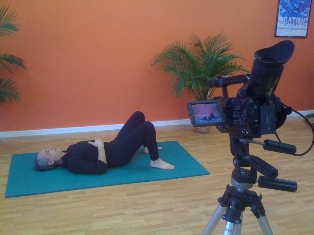
Yes, I worked on New Years Day art directing a video shoot for a Pilates instructor. After 4 hours of shooting, we got the video we need to create How-to videos for a series of eCourses Bob [the instructor] will be emailing out to clients on his mailing list.

One never knows what an instructional designer will do when working with subject matter experts. In order to fully understand the Pilates movements, I had a yoga mat on the side and did the poses as Bob was describing them.  This way I could be sure he was including all the information necessary to be used in the videos.   Being ready to emulate a situation, ask the right questions and give feedback to the expert are a few of the techniques I use when creating instructional design materials.

There are so many moving parts when shooting a How-to video.  Besides the basics of getting the material communicated correctly, there is; the set, mics, lighting, backgrounds, wardrobe, and direction.

It was a fun way to ring in the new year.

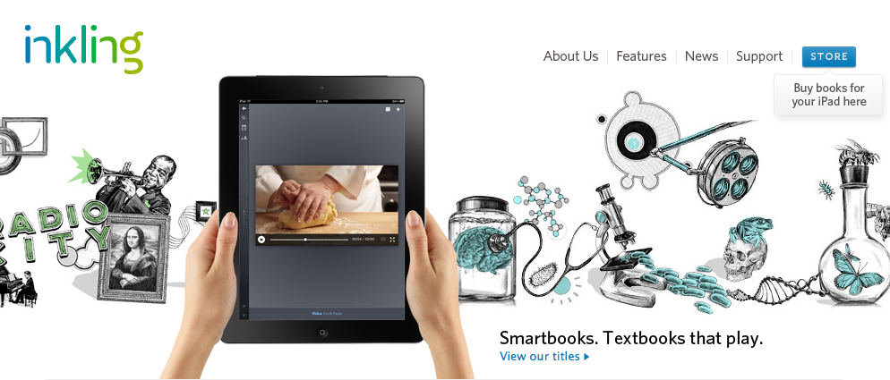
Now here’s another twist on the textbook Inkling. It appears they are incorporating the Adobe Digital Publishing functionality with a few of their own details.

One thing I really like is the Social Learning feature which allows users to interact with classmates.  So, you could ask each other questions and discuss ideas and questions.

You can download the Inkling app, for your iPad, then buy chapters or full books.  There are a few chapters, that are free, so I suggest you give them a try. Happy reading and learning.


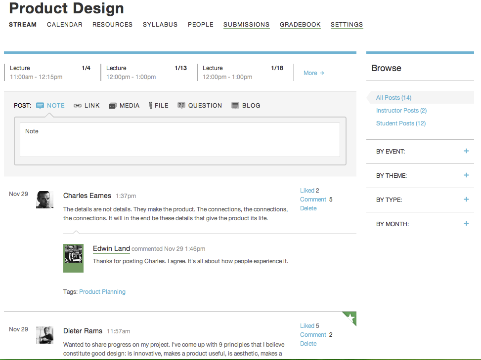
Here’s a way to streamline an online course. Coursekit brings the learning management system [LMS] directly to the instructor and student-i.e. The Users-all for free.  The experience is focused on simple and elegant and includes the basics: a calender, file sharing, submitting assignments, and grading work.  One noticeable difference, compared to other LMS interfaces, is how Coursekit brings the user directly into ‘the classroom’ and not to the typical dashboard…which makes it more like a real classroom experience.

Just as a student would walk into a physical classroom, online students first appear in The Stream of the your online classroom and it has the feel of Facebook.  Unlike Facebook, within The Stream, students can upload; text, images, video, and audio.  Each element in The Stream brings up a side panel when you click on it. As Coursekit’s creator Joseph Cohen explains, “The result is that it turns short stuff into long stuff.”  This allows the ability to have a space to discuss in length and works much like a Twitter feed.

As for textbooks, Coursekit is pursuing an online free system for textbooks as well. “The textbooks of the future will not be textbooks,” Cohen says. But there will be a need for educational content, and much of that will be bought (remember, direct-to-instructor is already at the heart of that businesses). If all goes well, Coursekit is the seed of the storefront of the future for educational products, with a ready-made group of customers who are already logging in. All this might look something like Inkling.

In my humble opinion, it is all driving towards a more personalized experience for learning and it’s all quite exciting.


MIT today announced the launch of an online learning initiative internally called “MITx.” MITx will offer a portfolio of MIT courses through an online interactive learning platform that will:

  • organize and present course material to enable students to learn at their own pace
  • feature interactivity, online laboratories and student-to-student communication
  • allow for the individual assessment of any student’s work and allow students who demonstrate their mastery of subjects to earn a certificate of completion awarded by MITx
  • operate on an open-source, scalable software infrastructure in order to make it continuously improving and readily available to other educational institutions.

MIT expects that this learning platform will enhance the educational experience of its on-campus students, offering them online tools that supplement and enrich their classroom and laboratory experiences. MIT also expects that MITx will eventually host a virtual community of millions of learners around the world.  READ MORE.


Since August, I have been on a journey working with some fabulous educators, instructional designers and just all-round wonderful women drafting outlines and creating the content for a chapter that will be published in a book which is being published by the International Association for K-12 Online Learning [also known as iNACOL]. We just completed our draft of our chapter and are so excited.

This chapter will present a student-centered model for online teacher mentoring. The one-to-many online model is designed to be scalable, self-directed, and leverages social learning. The program, Self-Directed Learning [SDL] Support Model: Training Educators for Online Learning, introduces teachers to ideas of self-directed learning, partnering pedagogy, and metacognition while orienting new and prospective virtual teachers to the online learning environment. To maximize impact and sustainability, this program employs the Cognitive Coaching model through a social learning community.

Without giving away all our secrets -you’ll have to wait until the whole book Lessons Learned in Teacher Mentoring: Supporting Educators in K-12 Online Learning Environments is published [due out in the fall of 2012]- we explain ‘how’ we developed and taught an online course which has helped many educators-across Massachusetts- become better learners and in turn better educators.

Our chapter goes into great detail explaining how we used self-directed learning techniques and skills to teach educators how-to understand and use essential self-directed learning skills such as: goal setting, metacognition, motivation, critical thinking and time management.  We also discuss how we designed our online course, how we delivered it and how we improved it.

I can tell you that by implementing the use of social learning, collaboration and ePortfolios we have had a very good success rate with this online course. Here is what a few of our participants said about our course:

“This was a new way to approach teaching.”

“The course really helped me understand how to encourage and coach students not just around content but around linking content to their own goals in life.”

“It’s cool to watch students change over the course of the year. They start talking about what their goals are and what skills they’ve learned. Online learning puts their education in their own hands—it’s wonderful!”