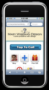
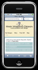
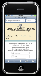
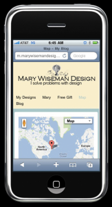
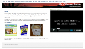
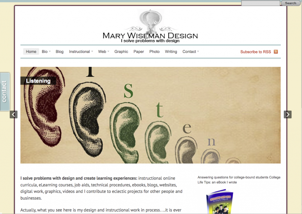
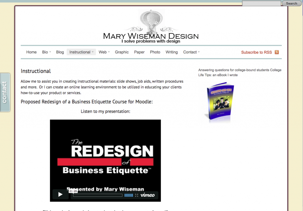
I just finished getting my website into a mobile format, so it is can be easily read with smartphones and/or tablet devices. Now, information about my design work is easy to find while on the go.
I have created: easy tap buttons for calling or navigating, accordion menus that expand to reveal more in depth information, videos are available, and I have my free gift ready for folks to download.
If you need your website to be mobile, look me up [on your phone] and give me a call. I can design and create a mobile website for you and your business.
The mobile phone market is growing and you should be growing your business along with that expanding market. According to the 60 Second Marketer, there are 6.8 billion people on the planet, 4 billions of whom own a mobile phone. Do you know how many people own toothbrushes? 3.5 billion. That’s right, more people own a mobile phone than own toothbrushes.
People are using their mobile devices to: locate, learn, communicate, shop, and they respond. It is predicted that by 2013 the primary way people will access the Internet will be via their mobile browsers.
